Christian's Blog #5
The Golden Rules of Design – Part 1
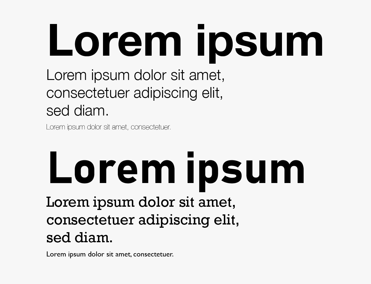
Don’t use too many fonts 3 Max
“Graphic Design is art with a purpose.” The main aim of a graphic designer is to visually communicate information or an idea to the audience. When it comes to selecting typefaces, the more variation the more lost the message becomes. Two fonts are perfect, 3 fonts are fine and any more is pushing your luck. The reason for this is the visual hierarchy of the design. Visual hierarchy is the arrangement of elements in the design in order of importance, in short, the important things are bigger.
Loads of different fonts play with the eye, making it harder to determine what’s the most important part of the design and making the body of work a lot harder to understand.


Don’t use too many colours
Colour is possibly the most effective way to get the message of your design across to the audience, however, using too many colours causes confusion and won’t have any impact.
There is no right or wrong answer but, similar to the fonts, you should be aiming for around 3 colours, 3 is perfect as it allows enough variation to create something interesting, however, don’t split your use of them equally. Try using the 60-10-30 rule, it’s a very simple rule for creating well-balanced colour schemes. Pick your main colour, this is going to take up 60% of the design, the primary colour for this palette, it can be a neutral colour or maybe something a bit bolder. Next, something that complements the primary colour, this is going to take up 30%, it should play right into the hands of your primary colour. Finally, an accent colour, will help elevate your design and should give it more depth and contrast.
Alignment
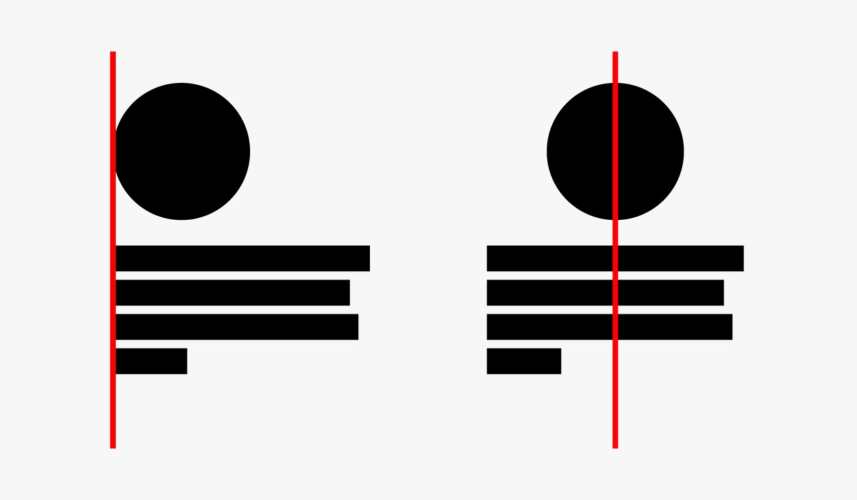
In Graphic design, alignment is used to create structure in the composition making your design easier to understand to its audience, it helps the human eye follow the path the designer intended, communicating the ideology of whatever is being represented.
The basic types of alignment are edge alignment and center alignment, these utilize an invisible line going either through the center or edge of an object, aligning to one or the other helps give structure to your design. Using a margin will help keep the design on the track it needs to go, everything begins the flow together.


Take inspiration
Don’t be afraid to take inspiration from people who are better than you, you won’t learn anything if you don’t. There are thousands if not millions of resources and people you can learn from, better your skills and develop your knowledge. Inspiration helps open up how you perceive your own ability, allowing you to achieve things you might not have believed possible or even attempted.
Lastly, once you’ve learned all the rules, and believe me there’s a lot more than what I’ve mentioned here, you can start to break them, it’s an old cliche, but that’s where the groundbreaking stuff comes from. As Picasso once said, “Learn the rules like a pro, so you can break them like an artist”.
Call us today to get started on your creative journey at 01204 917 817 or email us at info@designersroom.co.uk


